
The Corporate Communications team at Booz Allen was reorganized with new leadership, a new combination of functions, and a new agency model for processing work.
Executive leadership had questions about errors, delays, and inefficiencies, but they were difficult to answer because projects were passed between teams and followed different processes depending on requirements.
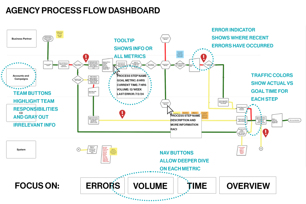
We were preparing to launch a new PM tool that would give timestamps for every step and follow each process, but it was still a lot of data and didn’t provide a great overview of the whole system for leaders. I mocked up this dashboard, designed for PowerBI, that would automatically pull timestamps and project identifiers and present the information in a traffic-style flowchart to give KPIs at a glance.
Each project in the PM tool already had a preset list of task particular to that project and the accompanying timestamps. We also had a table of the expected time for each task, which could be joined in PowerBI to create the colors (green for on time, yellow for at risk, red for delayed).
The visualization could be shifted to focus on errors (noted based on the step where they occurred), time, or volume. Team buttons highlighted just the steps a given team was involved in without removing the rest of the dashboard data. Hover tooltips described the task, teams/responsibilities involved, goal metric, KPI, volume, and error rate.
This dashboard gives leaders a big picture view of all moving parts within the department and allows accurate assessment of volume, errors, and speed in order to efficiently allocate resources and address issues.

Leave a comment