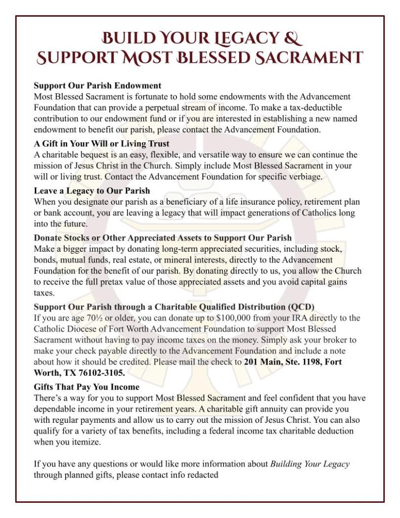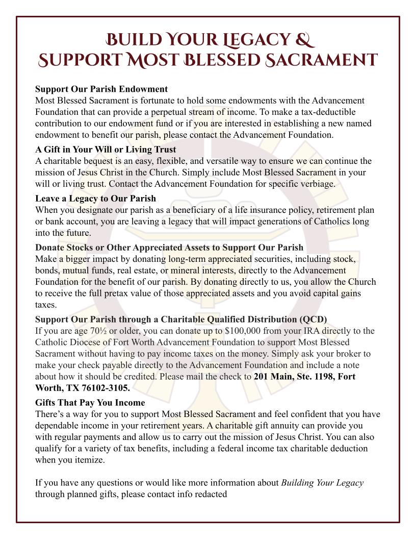
This insert is a continuation of a previous logo design project. The client liked the branding system I made and wanted an insert developed quickly to go in the weekly church bulletin.
The content provided for this insert was text-heavy, but needed to fit on one side of a piece of paper and be readable to older individuals. I was able to use simple formatting to allow people to skim content while still maintaining a larger (14pt) text size.
The border and color logo watermark draw attention and maintain consistency with the church’s other stewardship advertising materials. The watermark is clearly visible in a color print, but light enough to not show/distract from the text should the flyer be copied in black and white.

Leave a comment