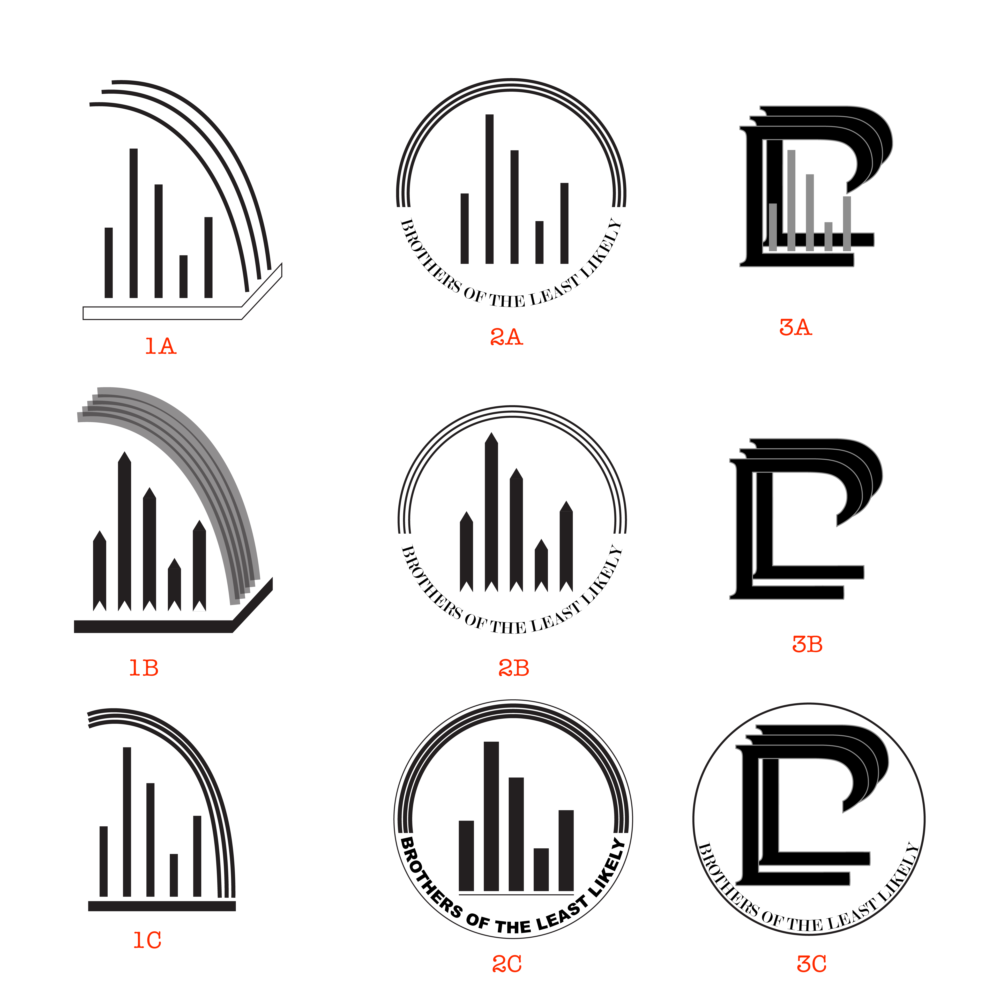
The client was a small group of five men whose church club was about to be made official. They asked me to develop a logo based on some sketches that incorporated elements meaningful to their group.
My initial proposal included three variations of three different styles of logos. The first style was a literal digital version of their sketches: five bars, a base, and three lines arcing over the group. I included 2d, 3d, and stylized versions of this logo. For the second style, I took the elements of their logo and turned it into a badge. Some of the logos that the group showed me as examples of what they liked were lettermarks, so for the third style I created a lettermark that involved combining the letter B (for brothers) with two Ls (for least likely). The top curves of the Bs form the rainbow from their original sketch.


Leave a comment