
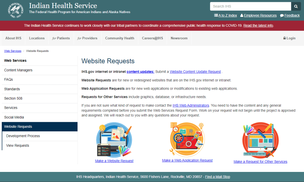
The Website Requests page was causing issues for both end users and the Web Team staff. As procedures changed, small text updates were made to the page to direct users to the new ticketing system or an updated email. The instructions were confusing and icons near the bottom of the page drew users’ attention away from the information they needed in order to submit the appropriate type of request.
As a result, updates were being sent to the wrong people, requests were delayed, and some users were being directed to seek approvals and additional information that was unnecessary for the scope of their request. Three images were linked to three ways to submit a request, while the most common type of request (content updates) only had a text link on another part of the page.
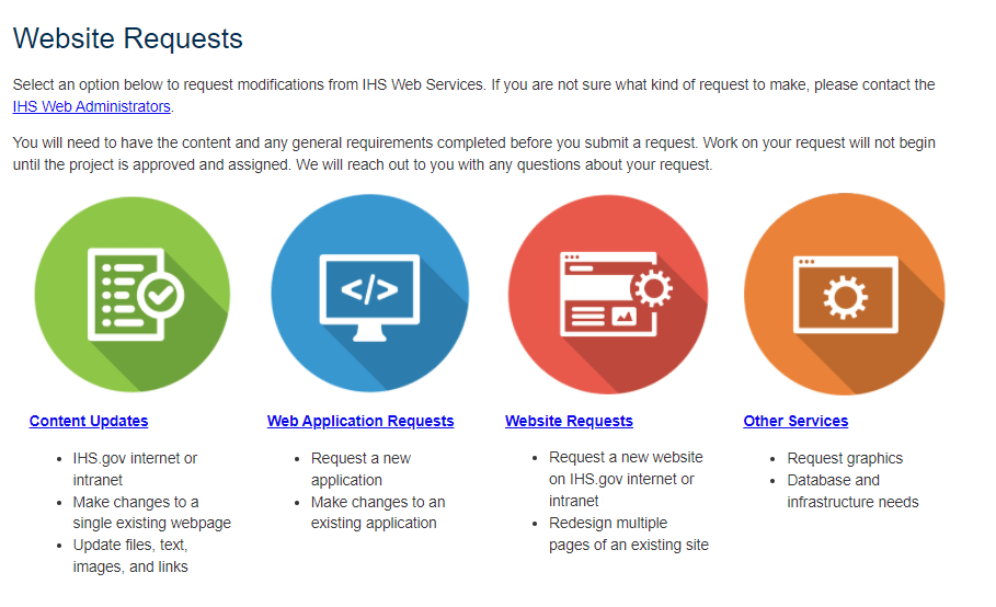
I redesigned the page to make the types of updates more clear. Four large icons draw the user’s attention first to the four types of requests they can make. Immediately below each icon is the request type name and examples.
If the user is still unclear on which option they should choose or they have other questions, the last place their eye will go is to the text at the top of the page. The first paragraph provides a link to an email where they can reach the current web administrators.
Minimal further information is included in the second paragraph, with most steps and information placed on the request-specific pages linked to below the icons.
Since updating this page, we have received 100% fewer content updates inadvertently submitted as website requests. This speeds up the user request publishing time from a few weeks to a couple of days and eliminates unnecessary approvals from department heads.

Leave a comment